Aug 17 2009
Why Are Gauges Important?
Here is a number: 50
Here is a gauge:
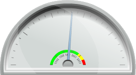
Which is more effective? Which conveys more information, and why?
Digital Dashboards
Decades ago car manufacturers experimented with digital dashboards. Ever wonder why you don’t see more of them today? People hated them. Some newer hybrid cars are using more digital dashboards, but most of the cars on the roads today – even newer cars – have analog gauges. If any digital information is displayed it is generally a supplement to the analog information, rather than a replacement. Speedometers, tachometers, even fuel gauges still use analog-style displays.
Let me go back to the number and the image of the gauge that I opened the post with. The number 50 is just that, it’s a number. It is completely without context. It doesn’t tell me if that’s a high number or a low number. It doesn’t tell me whether it’s a good number or a bad number. An analog gauge can accomplish all of these things at once.
The number “50” expects me to understand the context of the number and be able to make conclusions. If I make the wrong assumption, I end up with the wrong conclusion. The gauge helps remove those assumptions and ensure the correct conclusion. I am going to break the gauge down into components and show how they all work together.
Simple Gauge
This is about as basic as a gauge can get. There is a container and a needle and that’s it.
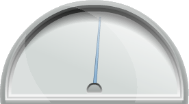
Even this most basic gauge contains some important information. Just by looking at the gauge I can see that the represented number is more than 50% of the gauge capacity. The needle is pointing slightly to the right of center, and by convention gauges fill from left to right. So without even knowing the exact number, I know that it is somewhere over half full.
Adding Tick Marks
For the next step I have added tick marks to my gauge. Here are a couple of versions of the gauge; look very carefully at the tick marks on each one.
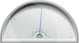
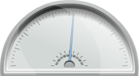
Tick marks don’t get as much respect as some of the other gauge features, but they’re important. There are more tick marks on the gauge on the right than on the left. The implication is that the scale is higher and therefore more tick marks are required for precision. The gauge on the left goes from 0 to 95 and shows a value of 50. The gauge on the right goes from 0 to 950 and shows a value of 500. The percentage of 50 into 95 is exactly the same as 500 into 950 but the scale is different. The density of the tick marks can show that.
Good or Bad?
So far I have shown how a gauge can take a raw number (50) and put it into context. I know that 50 is above half, and I have an idea of the scale because of the tick mark density. The next question is whether 50 is a good or bad number, and that’s easily done by adding alerts.

With the green-yellow-red alert added to the middle of the gauge I now have a complex instrument that communicates all sorts of information. These colors are fairly standard, but someone with red-green color blindness might not appreciate them. There are also issues with any delivery method that does not include color. For online viewing the alert does a nice job of completing the gauge. I can now easily derive all of the following bits of information from this simple gauge:
- The number is more than 50% of the total scale
- The scale is relatively small as denoted by the density of the tick marks
- Higher numbers are bad, as shown by the fact that upper numbers are in the “red” range
- Most of the potential gauge numbers are good, as shown by the broad range of “green”
Final Gauge
After showing how much information is conveyed by the graphical elements of the gauge, it might seem like extraneous information to show the actual value. But for some folks they might prefer to know the exact number rather than guessing what the gauge is showing. Xcelsius provides that option as well, resulting in this as my final gauge.
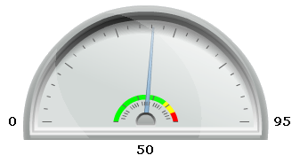
This gauge includes numbers for the upper and lower boudaries of the gauge, as well as the exact number represented by the position of the gauge needle.
Conclusion
Are gauges like the style I used in this post perfect? Clearly each gauge has strengths. When building a dashboard it is important to select the proper representation for each number, based on the information that needs to be conveyed. When I built my first web site (a very long time ago, in the time of AOL and dialup access to the Internet) I took an old phrase and updated it to this:
A picture is worth a thousand words… but a thousand words will download faster.
Today I might say this:
A picture is worth a thousand words… but only if it’s the correct picture.

Welcome aboard the Xcelius train, Dave! I knew we would eventually assimilate you.
I’m still not sold on the product. 😛 It has uses but it still needs work.
I liked it. Also I think I’ll learn something about XCelsius if you keep on writing about it.
I hardly use gauges at all. Why?
Consider what a gauge is NOT showing: No trend, no timeline, etc.
The space a gauge is consuming can be used instead by a simple line chart to convey measure(s) over time (last 12 months for example), including trend, alerts, etc.
Andreas, that’s a fair point, but one I think I addressed by saying:
This post was intended to review the different components of a simple gauge, not to suggest that it was appropriate for every single value. Clearly time-sensitive values cannot be shown on a simple widget like this. 🙂
Actually, I believe a gauge is a poor visualization in any case, I wish Xcelsius had sparklines to offer for example.
Often when a customer wants a dashboard designed, they have gauges in mind 🙁
Gauges in an autombile make sense as the needle (speedometer e.g.) moves with increasing/decreasing speed, this hardly ever makes sense in a dashboard displaying KPIs at a glance.
But I agree this is a different discussion about (good) visualizations, nevertheless I wish you had chosen a different example such as bar charts or heat maps, etc. 😉
Andreas, you have done far more research on dashboards so I defer to your input in this case. 🙂 When I was starting to play around with Xcelsius I was struck by how much information was contained in such a simple graphic and decided to break it all down in a blog post.
I wish Xcelsius would offer more control over bar charts such as spacing between bars, etc.
I wish I could switch chart types on the fly (such as one can do in Webi).
I wish Xcelsius would offer better control regarding colors (for example the region North America should show up in the very same shade of yellow in every single chart and map within the same Xcelsius model).
I wish Xcelsius would truly support “small multiples”.
I wish Xcelius would support global scales for a group of charts, with a button to switch to local scales for all charts within a grouping.
Hi Dave,
If we apply alerter on a report (NUMBER 50) then it would be similar to the gauge. It will show trends.
Alerters are not a substitute for trends. The point Andreas made earlier was that gauges cannot show trends because they only show one number at a time. Other dashboard elements are much more suited for showing values over time.
Consider a fuel gauge or a speedometer. Both are gauges like what is shown in this example, and they are designed to show only what you have right now rather than five minutes or even five hours ago. You don’t care what your fuel status was an hour ago, you only care what it is now, and a gauge is fine for that.
Reminds me, I need to buy gas on the way home from work today…
Here another post explaining why gauges are a poor choice for corporate dashboards: http://tinyurl.com/y9zlarj
Hi Dave,
Please post something about Xcelsius. We need to learn new tricks and techniques for it. And we have lots of hope with you.
Hi, Deepak, and thanks for your interest. To be honest, I don’t write much about Xcelsius because there are already a number of fine resources on the Internet that discuss tips and tricks for that product. As a starting point, may I suggest that you check out Everything Xcelsius which is run by my friend and fellow SAP Mentor Mico Yuk? They have regular articles and some really talented folks that contribute to that site.
Hi Dave,
Wanted to tell You and Andreas about a weird behavior of Gauge component in the preview mode. When I want to move the needle from left right corner, I actually have to move it down to up instead of moving around the gauge as moving on the corners of circumference of the circle. You know what I mean? Most of the people might know this, but I thought of posting this as my Lead who is new to Xcelsius thought that the needle doesn’t move right any further like its stuck at number 12 of a wall clock.
Hope they fix such weird things which could mislead people and give a bad impression about Xcelsius’ abilities.
Thanks,
Mohammed Hussain
There is an option on the gauge properties that adjusts this.
Dave,
Yes, I’ve seen that option after you told. Its in the Behavior Tab -> Common -> Mouse Tracking -> Radial. I haven’t been very good at checking out all the options before posting the question.
Thanks,
Mohammed Hussain
hi Dave,
I was trying to get a gauge in our reports (WEBI) but my developers team is saying that apparently you cant do them in WEBI. Can you give me your thoughts on this and eventually propose an alternative other than the low tech solution mentioned on this SDN post (http://scn.sap.com/thread/2023635).
thanks,
Vitor A.
Gauges are indeed not supported in Web Intelligence. As per Andreas’ comments above, they’re probably not the best choice anyway. I unfortunately do not have time to review the SCN post right now and provide thoughts about it.