Jul 31 2007
Alerters On Charts Part II
The Challenge
In a previous post I showed a way to create the illusion of an alerter on a chart using the full client product. In this post I will reuse the same technique with a slight twist so that it works in Web Intelligence as well. If you have not already read Part I please do so first so you will be familiar with the basic steps for this technique.
Here is a summary of the steps that I used to solve this in Business Objects:
- Create two versions of the chart: one green and one red
- Create a variable that shows the trend of the data
- Use the Hide Block feature of Business Objects to keep one of the charts from being displayed
- Position both charts in exactly the same space, providing the illusion that the chart is changing colors based on the data
This is all fine… but Web Intelligence does not have the “hide block” feature. So how do I solve this issue?
Solution using Web Intelligence XI Release 2
I started out by creating the same query and the same page layout used in Part I. I ended up with two charts: one is green and one is red.
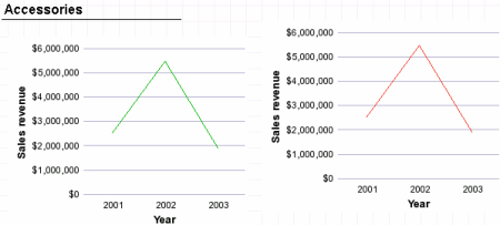
Since Web Intelligence does not provide a “hide block” feature I had to find something different. I experimented with different things and found that the following technique seemed to work. Instead of whining about the lack of the “hide block” feature 😉 I used a standard block filter instead. First I created the formula (which has a slightly different syntax in Web Intelligence) as follows:
=Sign([Sales revenue] Where([Year]="2003") - [Sales revenue] Where([Year]="2001"))
After creating that variable I created a block filter as shown here:
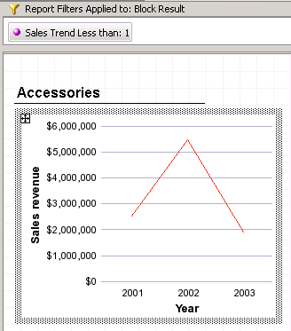
The filter is designed to create an empty block. However, the default behavior in Web Intelligence is to continue to show a block even if it is empty. This can easily be changed using the proper block attribute as shown here:
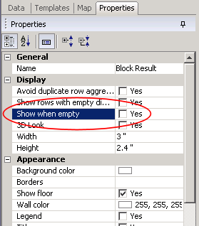
By clearing this checkbox the empty block will not be displayed at all. This is how I can recreate the “hide block” option available in the full client products. The rest of the trick follows the same steps that I used in Business Objects. I use the block positioning options (found on the Page Layout properties) as shown here:
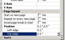
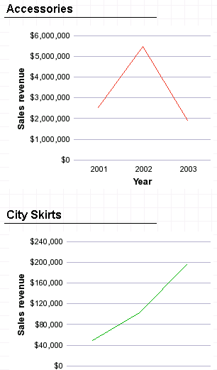
I set both the green chart and the red chart to exactly the same size and position, apply the changes, and review the results:
Summary
If you need to create an alerter on a line chart I have now shown techniques that can be used to solve that challenge in both Business Objects and Web Intelligence. Both techniques involve using two charts, a very simple variable, and then a platform-specific technique to hide a block.
Functions Used
- Sign()

This article is helpful. I have one scenario where the data is coming from an object SD wks = If([LeadTime]
Sree, your comment looks like it was cut off. You can’t use < or > from formulas in a comment as they will get interpreted as html and not saved…
You are genius, I had a similar requirement on WEBI, but it was with a pie chart, which had only 2 values Met or Missed, it was broken down by another dimension (i.e. section expert). I could use the colour pallet Green and Red when both were present, but in case only Missed was available it would show that one as by default Green, if both Met and Missed were there then was fine Green and Red. As I got the concept I used the concept and got around it. Thanks for your tips and tricks.
Cheers
Hi Dave
I’m new to your blog, this is really helpfull. Great job. I have a question from the above post. Is there any chance we can increase the thickness of the sales revenue line in the graph as we did in FULL CLIENT to improve the visibility. I checked all the oprtions in properties and couldn’t figure out. Please advice.
Thanks
Ravi
Hi Dave,
I have a similar problem but not exactly the same.
I should position a table block (block 2) exaclty in the same zone as the main table (block 1), but I should show the block 2 only when the report is empty…
I tried to create a variable
(something like this: if reportfilter([object])=””then “Yes” else “No”)
and to clear show when empty check box, but this solution seems not to work. Do you have any idea?
Thanks
Riccardo
Hi. Your guide is very helpfull but my req is more tricky =)
I need to create an alerter like functionality into the same chart. I mean, when the bar/line is positive it has to be green, when it’s negative is has to be red but I’m talking of the same bar/line.
Can you help me?
Thanks
Manlio
Hi, are you talking about multiple lines on the same chart? What I would try is to make two charts (as in the technique discussed here) and filter one so that it only shows positive lines, filter the second so it only shows negative lines, and make the two charts visible at the same time, with the top one being transparent. I have no idea that would work, but that’s what I would try…
Hi Dave,
in your example of green chart can we shoe the line going up as green and going down as red.
Mean suppose 2001.revenue is less than 2002.revenue then line from 2001 to 2002 should green,agai9n if
2002.revenue is greater than 2003.revenue then the line from 2001 to 2002 should be red and so on
Hi, I doubt you’ll be able to change the color of the line on a single graph, even with a multiple block solution. One of the elements has to be on top and therefore visible, and it would overlay anything underneath it.
Great help Dave!
I would like to add one more point here, instead of placing one template over the other, you could use ‘Relative Positioning”. So if one is invisible the other one dynamically will locate at the position of other template.
amazing technique dave…I am using this in a report. Thanks for this wondeful post
Hi Dave!
very useful information. I also have some issues with supress block logic.
I have a requirement to create a webi report which has grouping based on 3 entities e.g-
Company -> Hierarchy -> Account
in order to get this I have created 1st section on Company then inside this 2nd section for Hierarchy and my last section is on Account , Now here my hierarchy data is optional it’s not always associated to the company so i want to suppress my 2nd section whenever hierarchy is null in the database.
For that when i set ‘show when empty’ option in Hierarchy section properties it removes Account sections as well because it resides inside the Hierarchy section.
can you help me how can i achive to supress the Hierarchy section when it is nulll.
Here is the blog posted.
http://www.forumtopics.com/busobj/viewtopic.php?p=901127#901127
Thanks
Kanchan
Hi, your question is probably more suited for the topic you posted on BOB than as a supplement to this blog post, thanks.
Hi Dave,
How were you able to change the line color from green to red? The closest thing I found was the color Palette under Properties/Data, but even that did not give me full control over deciding the color of the line.
Thanks.
In this case I believe it was fairly easy because each graph included exactly one line. If you click the line and do properties (or double-click the line) I think I was able to change the color. I’m not able to confirm that right now but that’s what I think I did…
Hi Dave,
I have a diff situation and a question on how to hide a table. In the report I have 2 charts (pie chart and bar chart) and 2 tables. The pie chart is the main block which display % and has a link control the bar chart and the first table. The first table has a link control the second table.
1. I want to hide the second table when the report first opened and also every time when the pie chart gets clicked which causing the bar chart and the 1st table display diff data based on the slice of pie chart clicked on.
2. I want the 2nd table visible only when the 1st table gets clicked (on the first column).
Do you have a technique or formular to make this happen?
Thanks,
Becca
Today we have much better ways to address this, starting with element linking. I should probably write a blog post about that as it’s a bit too long for a comment. 🙂 But if you look for information on that concept you might find some ideas to get you started.